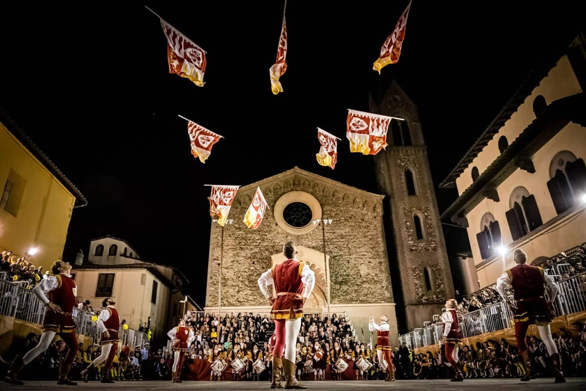
The challenge was to create a modern visual identity that could highlight the numerous attractions of the territory that are often overlooked, without compromising the inherent values of Mugello.
The Mugello valley, besides being the place where I was born and raised, is the
cornerstone of this project idea.
Over time, I realized that what the territory could offer to its
residents and beyond was much more than what it was currently offering; that the way I wanted Mugello to
be known didn't seem enough to me. I became convinced that my land has an invaluable value but also many
untapped potentials.
That's why I felt the need to tell its story and enhance it.
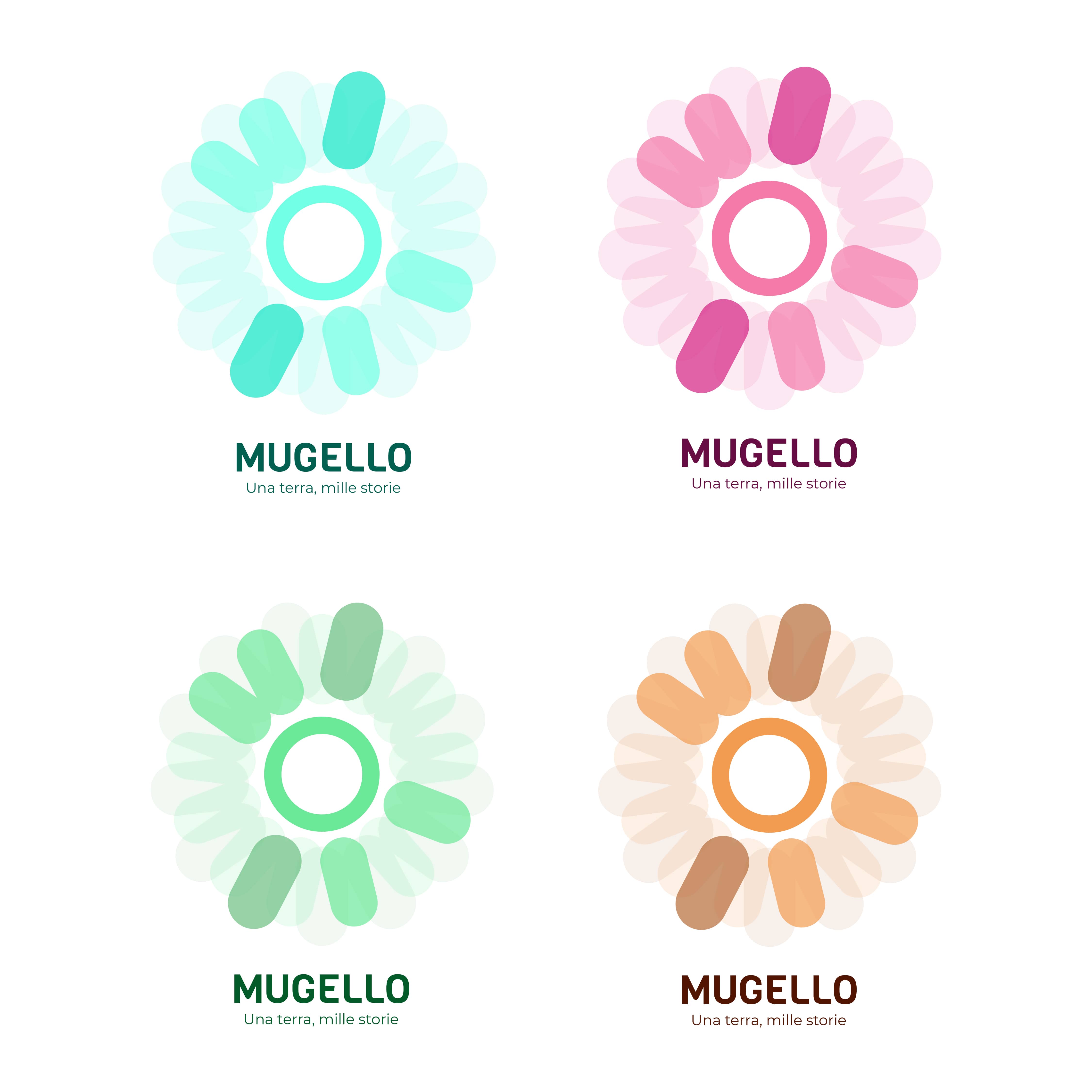
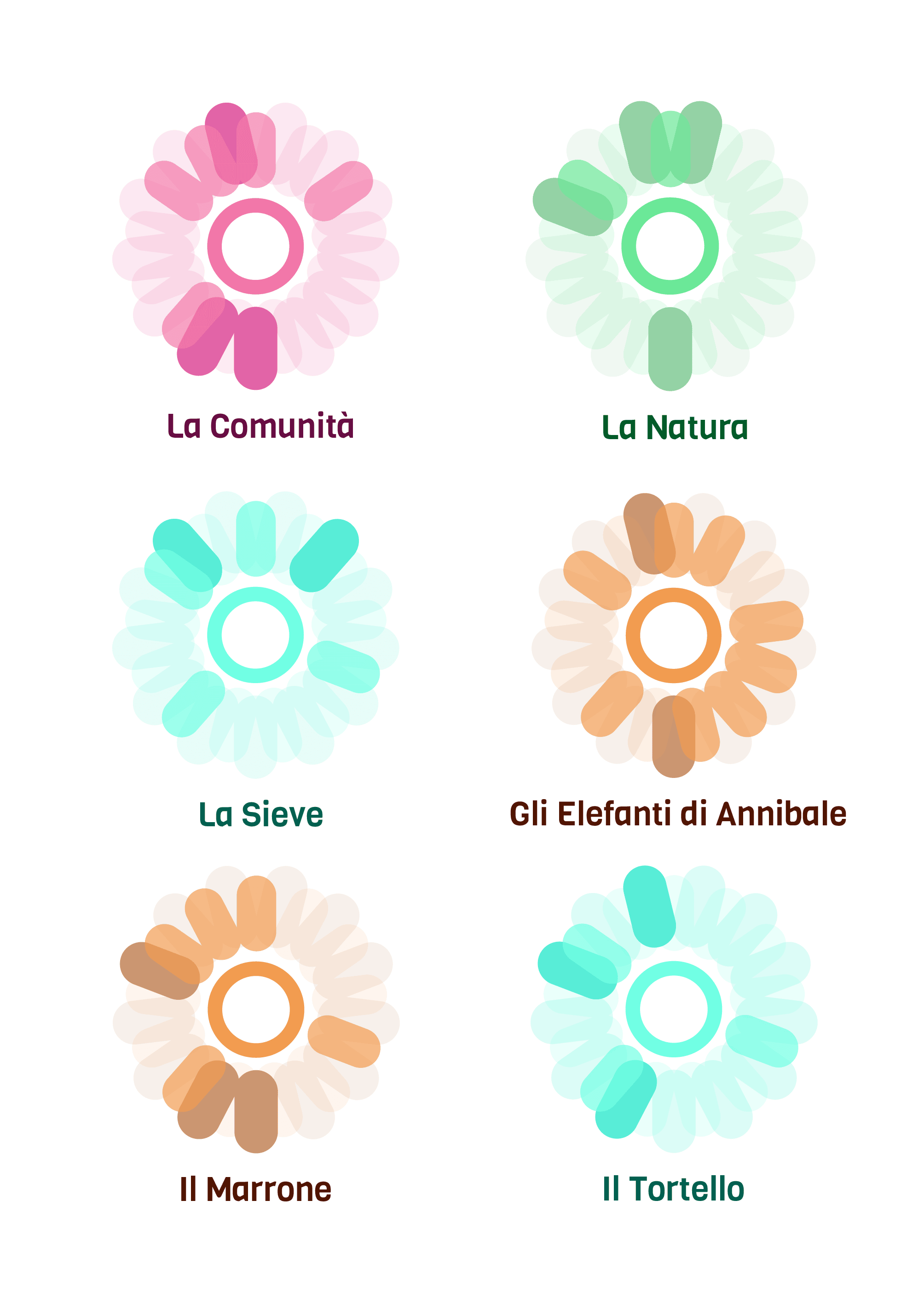
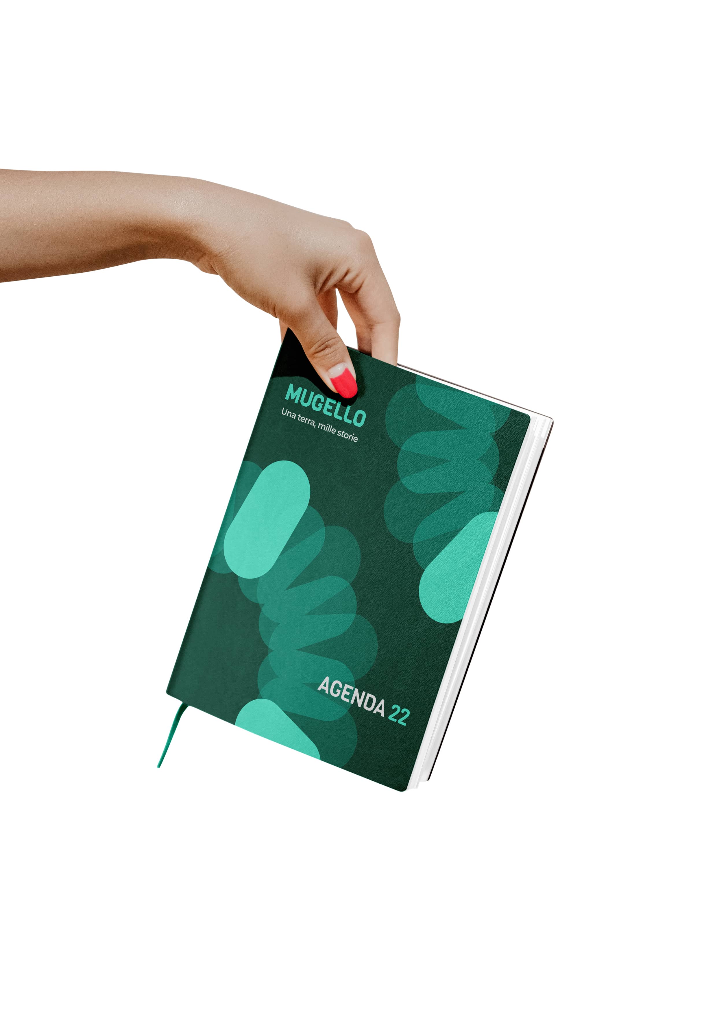
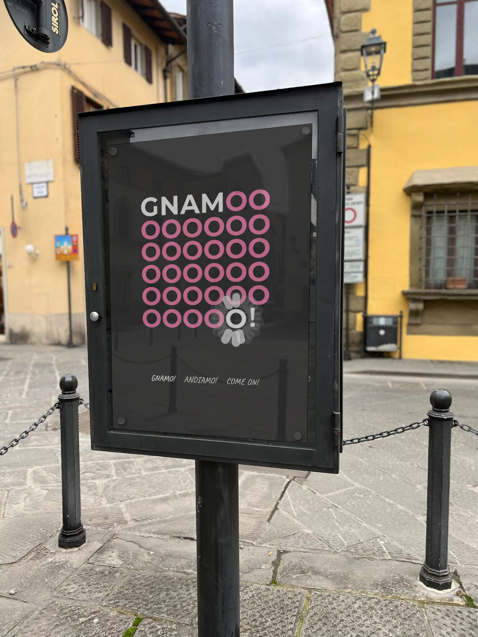
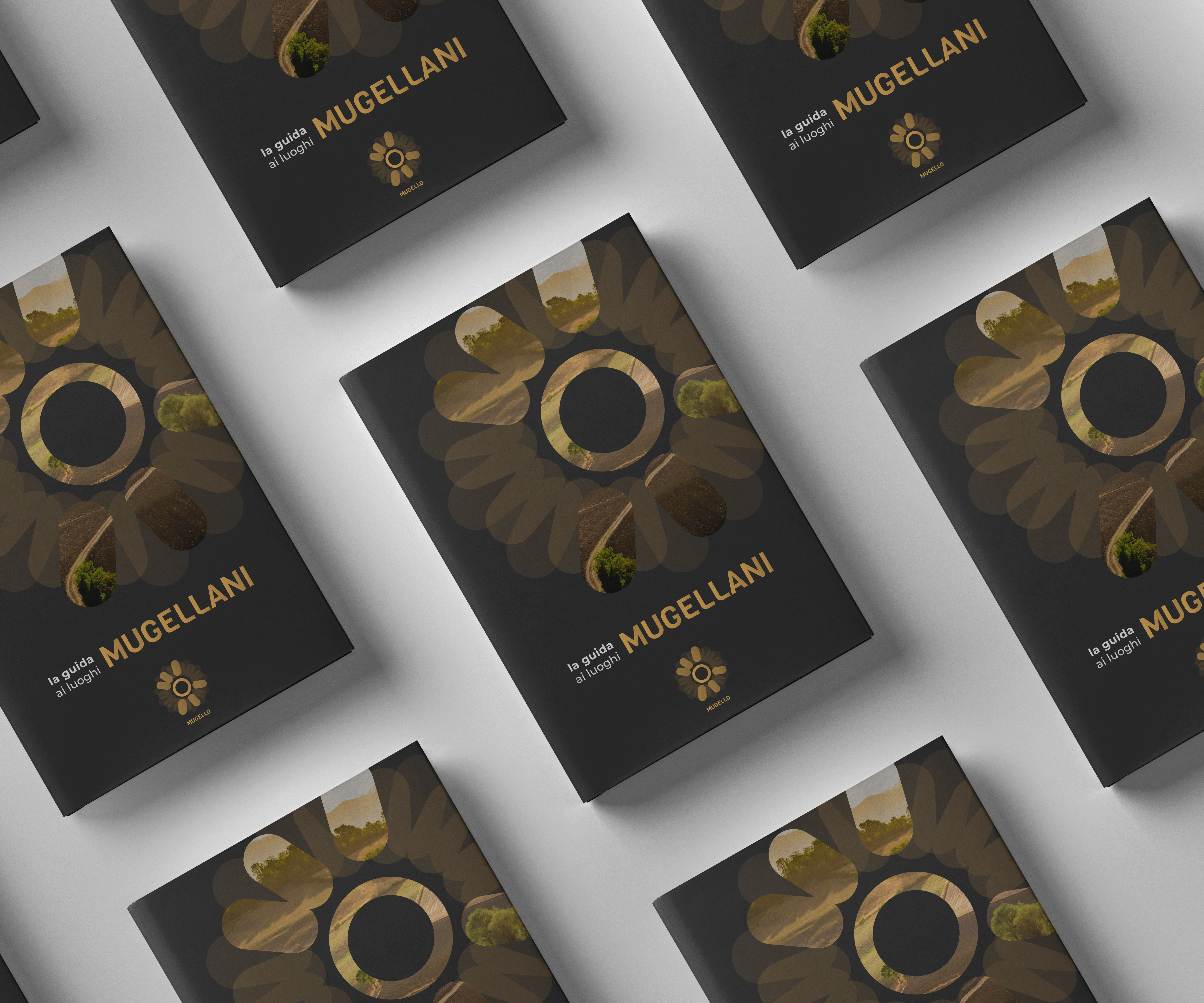
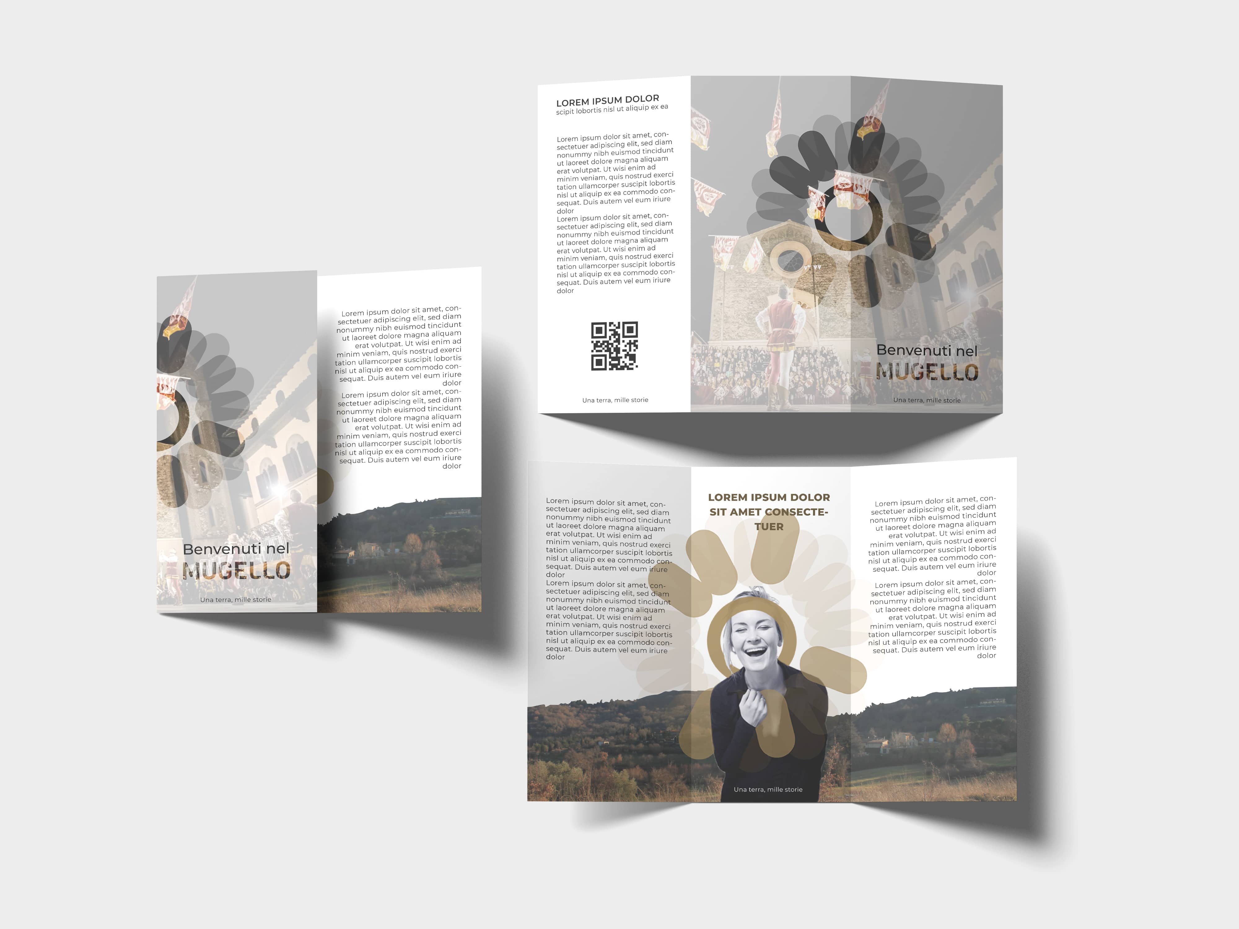
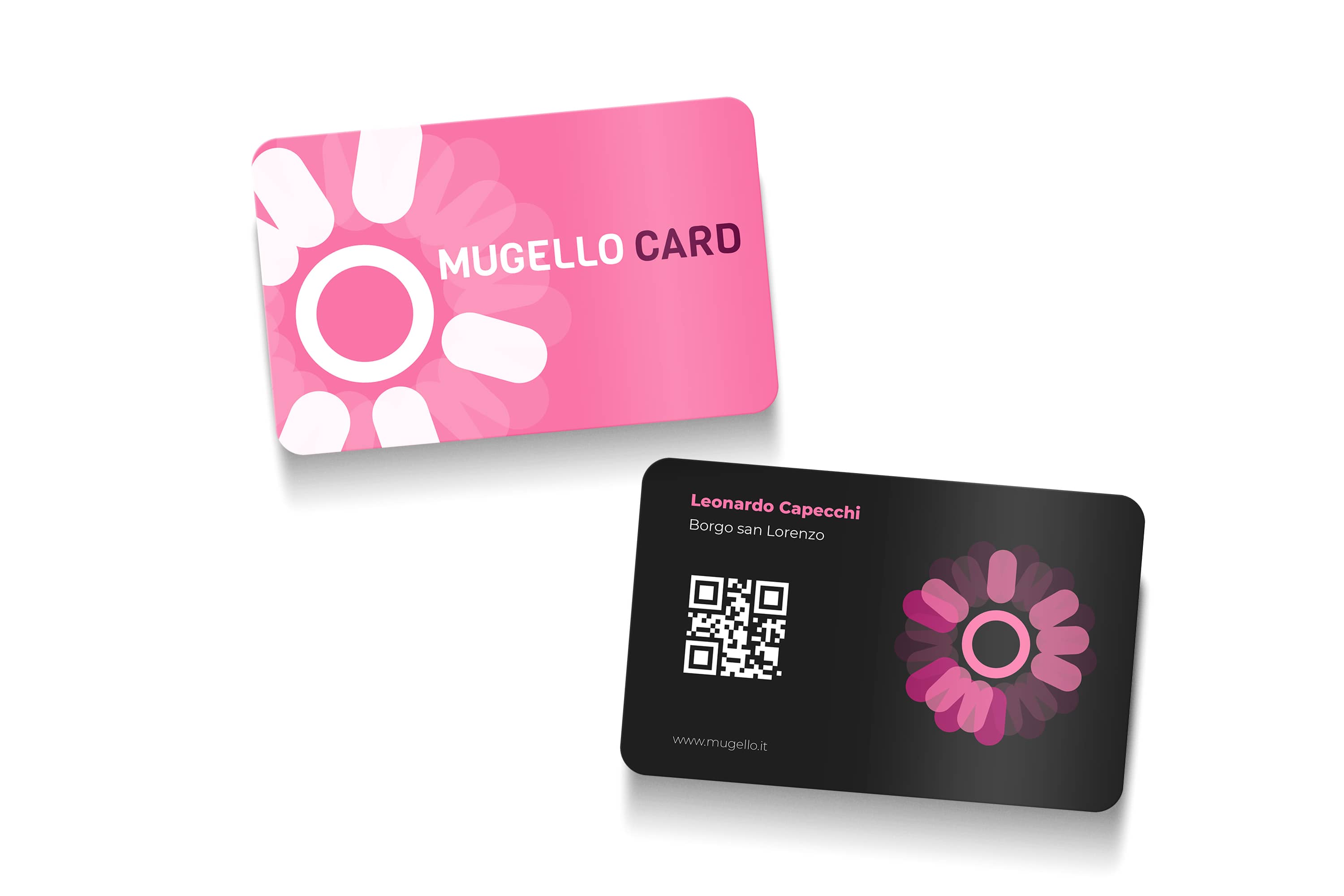
The symbol takes the stylized shape of a flower, with the unique feature that each petal
(in total there are 26) corresponds to a letter of the alphabet. This allows for the creation of a
dynamic logo, different for any characteristic associated with Mugello, while maintaining its basic
structure intact.
The system changes depending on what is to be represented, providing a visual and
graphic dynamism that reflects the diversity of the area, where many different souls and stories
coexist.
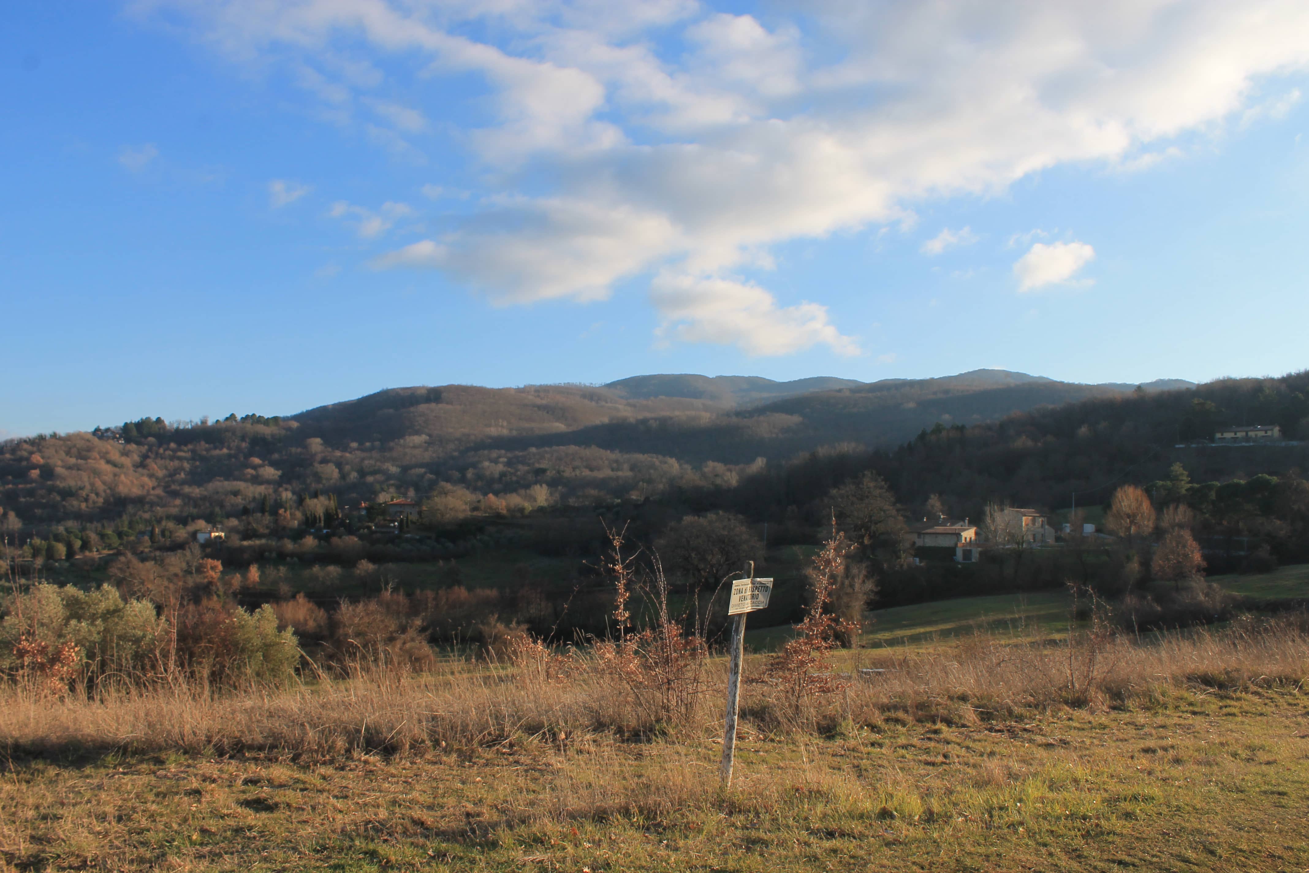
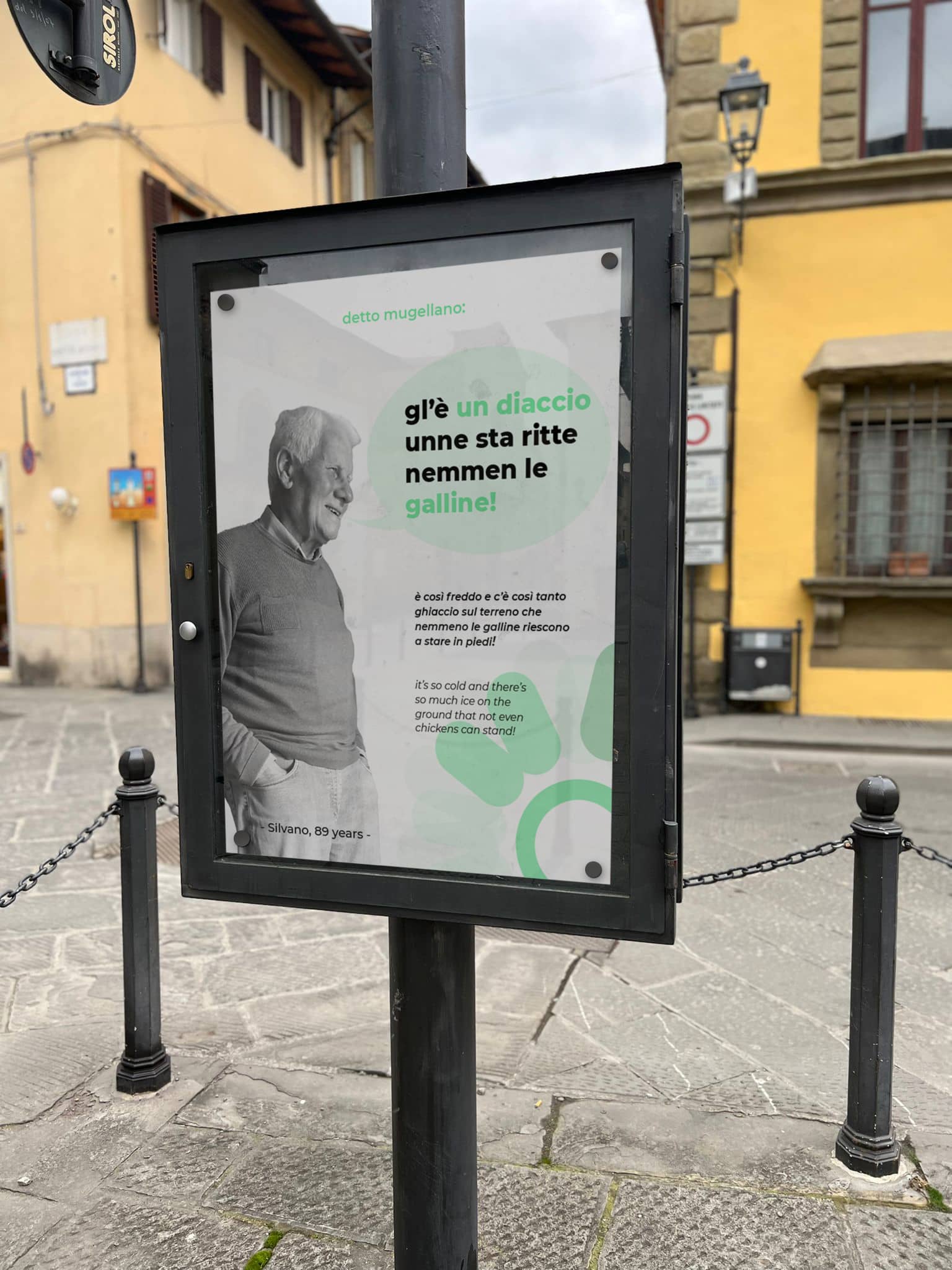
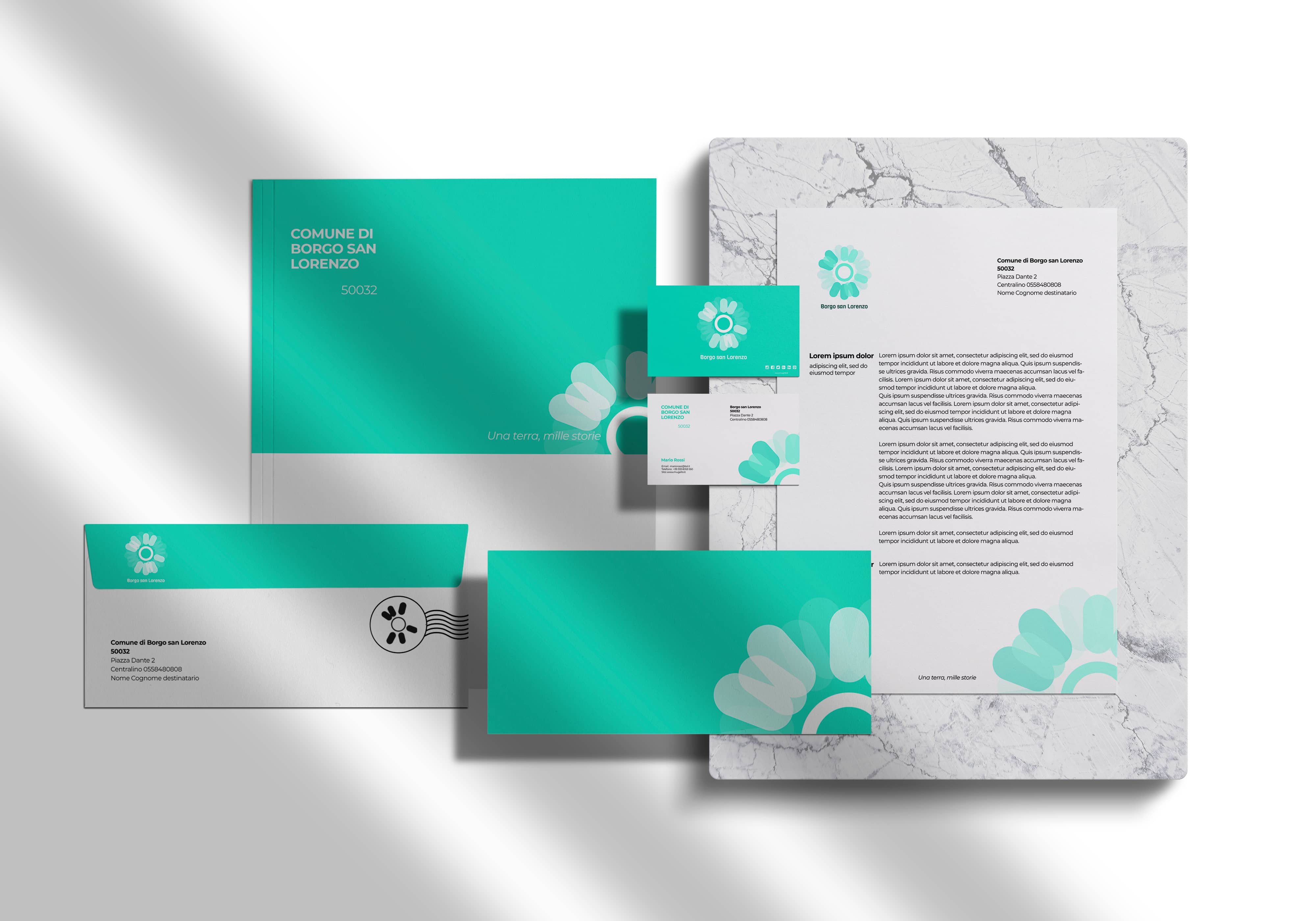
The system is also generative; in a place like Mugello, where nature reigns, the landscape tends to
change over time. Depending on the season, one can encounter different scenarios and colors that offer
wonderful and varied panoramic views.
In the visual identity, an attempt has been made to emulate
this characteristic by coloring the logo with a different palette depending on the season.
.jpg)

")